Meet John, the Painter

IMG_8134 (600x800) I’ve been delaying this post, because I’d hoped to show you some of the rooms. Before and after photos and all that. But all the rooms are still works in progress, and now I’m sitting in the dining room (my temporary office and kitchen), listening to ridiculously loud noises coming from what used to be our kitchen and family room. The demolition has started. But it is nevertheless time to introduce you to John, the painter.

John’s father Nick immigrated to Detroit from Greece in the late 1950s. Nick started the company in 1965 and fifteen years later, John and his brother took over the business. He says it’s the only job he’s ever had (working for the company in various capacities). And what do you like most about it?, I asked. He loves everything about it; he doesn’t feel the need or the want to do anything else. And he’s gotten to work for a lot of influential people.

IMG_8135 (600x800)You can tell John feels a lot of pride for his company. I asked what sets Nick Karoustos apart from other paining companies and John emphasized that it’s a family-owned and operated business, and that they do not sub-contract their workers (which is one of the reasons we hired). They provide healthcare and benefits to their employees, “which provides longevity and stability,” he added.

IMG_8136 (600x800)

The window coverings came down and stayed down (though we did keep one set for the guestroom).

And trends? People are going more neutral (see, we’re on trend. I knew it). He doesn’t see too many faux finishes anymore. And wallpaper is coming back (HA. You knew that one was coming, right?).

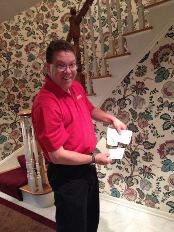
John declined a photo. (But if he comes back to paint the new kitchen, I’ll try again!).

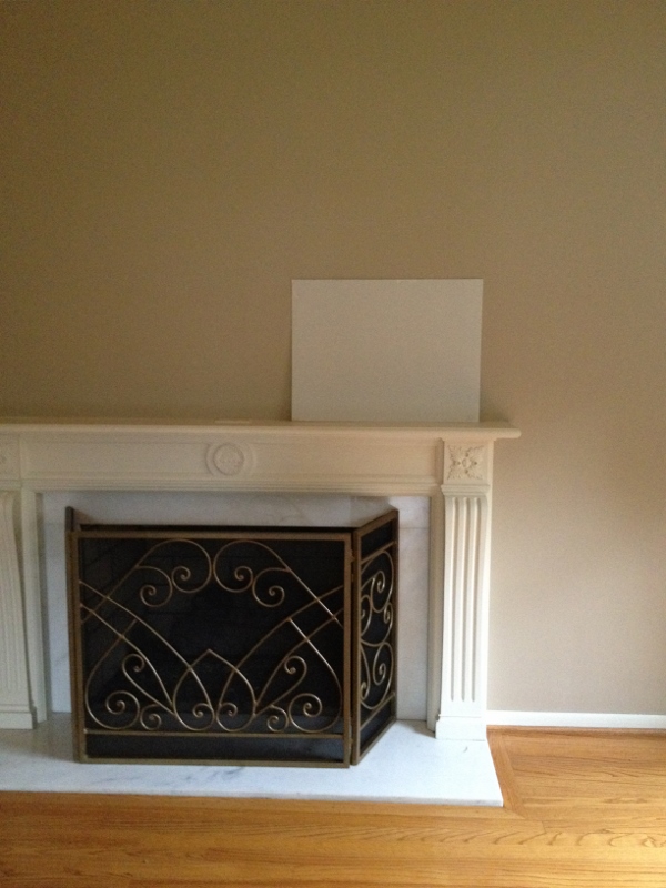
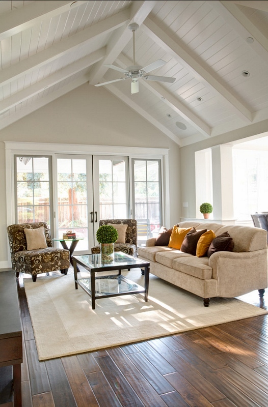
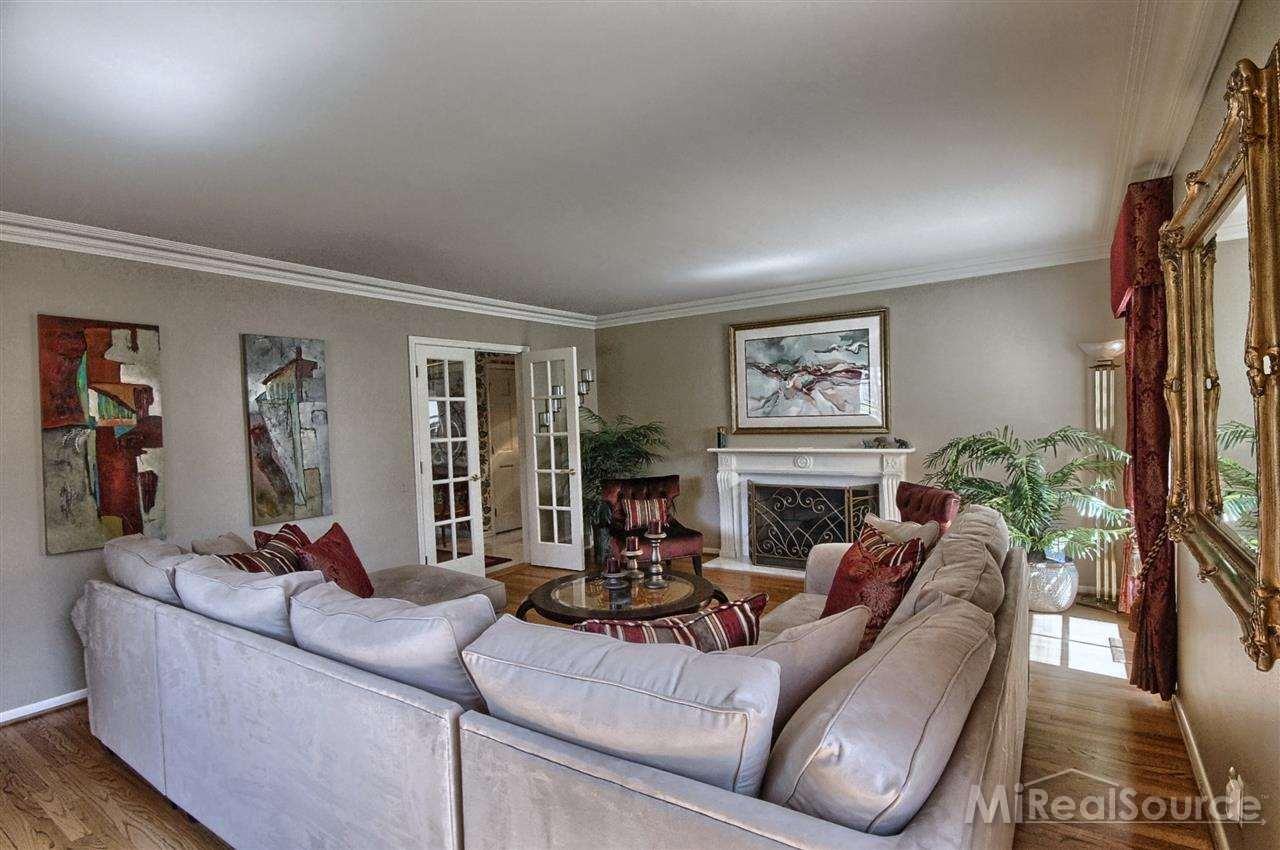
The house looks great with the new paint. The color in the dining room is the perfect shade of green. And you’ve already seen the white living room (which again, is by no means finished. We need to decide which painting to put above the fireplace, for example. And you know all about that rug.)

house.living

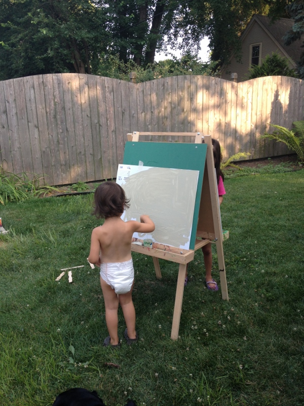
I do like that they have plants. We need indoor plants.

living

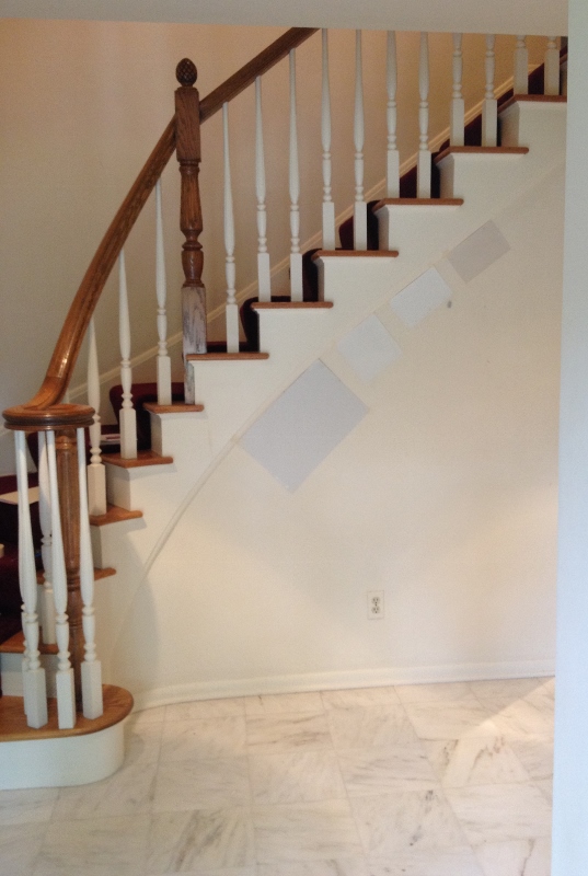
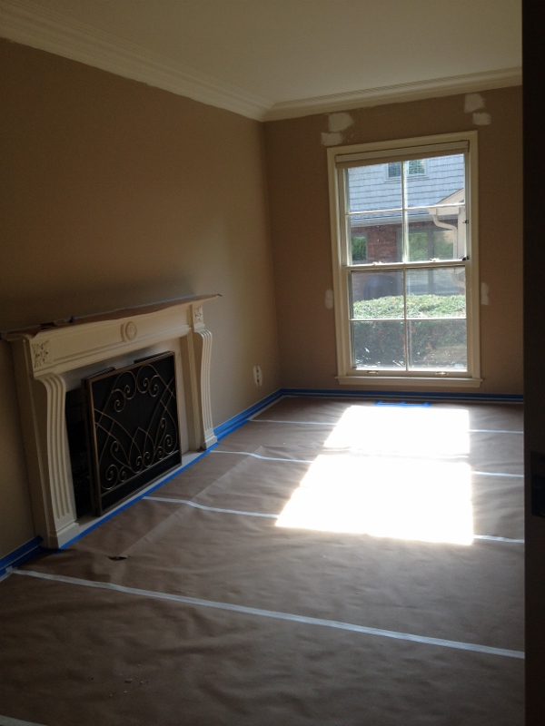
From the photos, it doesn’t look like a huge color difference, but the lighter walls really brighten up the room (literally and figuratively).

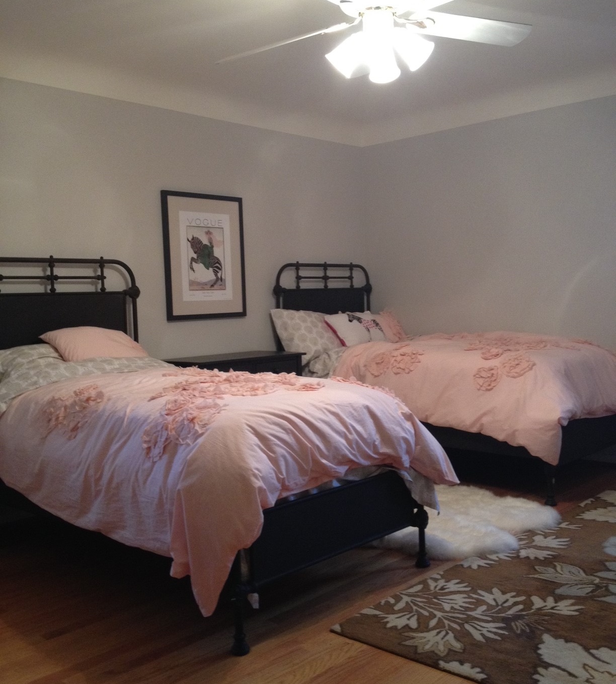
The girls’ light grey rooms are great. Here’s one of the bedrooms.
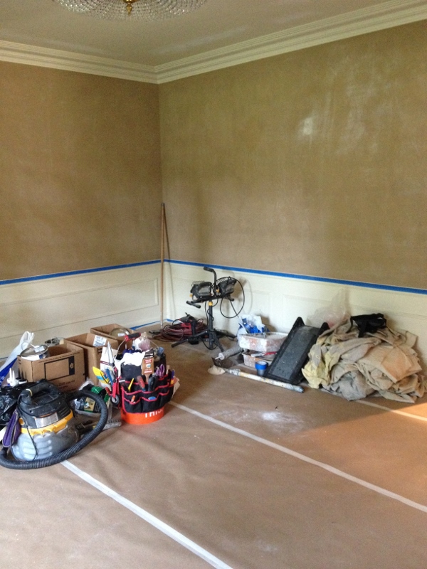
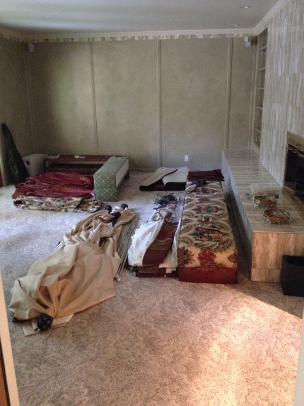
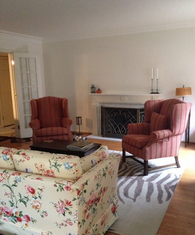
house.3rdbedroom (800x533)

Before.

lucy

After. (And see, wouldn’t the zebra rug look great in here?)

But the entryway is very……blah. It’s my one paint regret. With some new decor (eventually a console table and a lamp instead of a bench), I think it will be a lot more exciting. Win some, lose some.

homes.wallpaper

IMG_8463 (653x800)

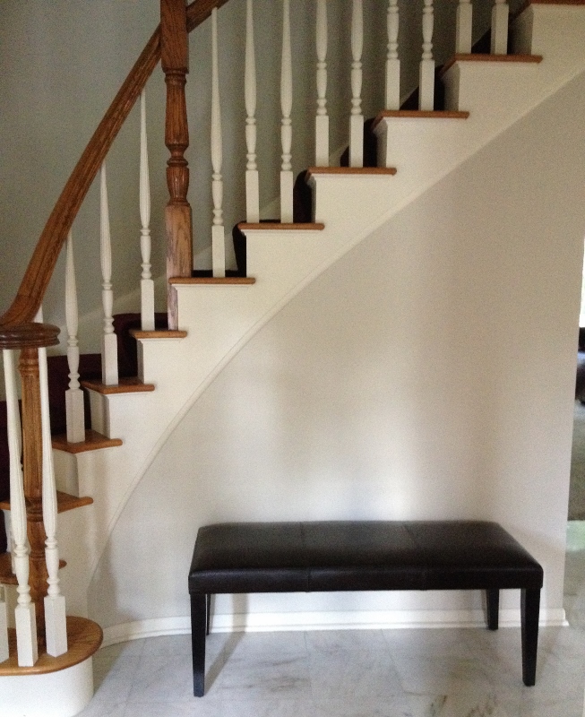
BO-ring. Until we spruce it up.

The designer friend I hired did ask if I like wallpaper (DO I!) and suggested putting wallpaper in the entryway only (near the front door, where I’m standing to take the photo), which would make a statement and add some interest. I thought it was a great idea and as soon as we can make it happen (after Christmas?), you’ll be hearing about it.


In Pursuit of Paint

IMG_7871 (600x800)If you’ve been following the blog, you know that I’ve been obsessed with finding the perfect paint colors for the house. Now that the wallpaper was off and the hardwood floors uncovered and cleaned, it was time to paint. I’d already met with Tim over at Shelby Paint, but now I had to put our selections to the test.

I bought a bunch of samples and let the girls help me paint poster boards (as you can see, the above pic was taken a while ago – Lucy is still in diapers and we’re still at the Apartment), which they were thrilled about. Then I took the boards to the new house to check them out.

IMG_7882 (537x800)Color is a very tricky thing, as I have learned over the last couple months. I knew it already, but wow. Colors change from one room to the next, from one foot to the next even, sometimes. And of course they change drastically depending on how light or dark the room is.

Initially I’d picked Athena for the entryway (the largest of the samples above), but now it appeared too blue. We (meaning me, as my husband was rolling his eyes at this point) decided to go with Manchester Tan instead, the darkest color shown above.

IMG_7873 (601x800)Our dining room pick, Nantucket Grey, was perfect.

IMG_7875 (600x800)And for the living room, we were originally going to go with Athena as well, but again, it looked too bluish. I really wanted a light, airy feel to the living room, so I went with the controversial Navajo White (poster board is Athena). Before selecting a white, I went online and read various reviews from both experts and DIY folks. Many experts poo-pooed Navajo White, saying that it felt too “rental apartment” or boring. But that Linen White was a beautiful white.

Anyway, I looked up Linen White, and it is seriously almost exactly the same formula as Navajo White. So there. And I went with the old design rule (whose rule? I don’t know, but I’m sure it’s a rule), if you like it, then who cares what anyone else thinks?

COMING UP: In my next post, I’ll introduce you to John, our painter, and reveal my one color regret. Can you guess?


Meet Tim, the Color Expert

color2 (600x800)

My bad on the blurry photo. This is maybe the second or third time I’ve ever asked a “stranger” if I could take their photo (my introverted self applauds my bravery and excuses my poor photography. Hope you will, too).

Meet Tim, the color expert at Shelby Paint (the local Benjamin Moore store). We met at the new house yesterday to finalize colors for the walls.

But first, lets turn back time a couple weeks. I was in the thick of researching, reviewing and setting up appointments with various contractors and was starting to doubt my ability to make decisions (when you’re talking about spending large sums of money, you want to get things right. Or at least close).

My (exasperated?) husband suggested hiring an interior designer, which pretty much everyone does here. And they are everywhere. Seriously, I have seen more interior decorator/design shops and businesses here per square mile than….well, at least than any other place I’ve lived. After giving it a lot of thought, I agreed we should go ahead and take money out of the home improvement budget and hire someone. However.

color (652x800)

Our “office.”

My gut didn’t really want to go that route. So I called up my friend and former roommate Liz for her take on the matter. She completely changed my mind, arguing that so many places nowadays will provide design help for free or for a small fee that you can put towards goods or services (upholstery shops, furniture stores, paint stores, carpet places). And, she said, do you want to spend $150 an hour for someone to show you paint samples? No. You have a good aesthetic, she said. You can do this.

Really what she did wasn’t change my mind. I already knew what I wanted to do (or not do, in this case). I just needed someone to believe in me. Before I spoke to her, I felt so overwhelmed and stressed by all of it – the scheduling, the interviewing, the decision-making. After I got it into my head that I could do it, I just got it done. Bing bang boom. Funny how that works.

nantucket gray

Nantucket Gray, dining room.

One of the calls I made was to Shelby Paint. For just $90 ($50 of which you get back in the form of a gift card), a “color expert” will meet with you and help you pick out a color (or in my case, colors) for your project. Bam.

Flash forward to yesterday. How did you end up being a color expert?, I ask Tim. He tells me he started out in sales at another paint shop in town (which has since closed) in the early ’80s. One day his boss asked him if he’d be interested in helping a friend of his pick a color for his office (or house? Drat, I wasn’t taking good notes at this point). He goes over and helps the guy out. Then down the line, he helps another guy out and another, and pretty soon it becomes a regular thing.

Athena-858 (526x800)

Athena, entryway and living room. (photo via homebunch.com)

After the shop closed, he moved to his current job at Shelby Paint/Benjamin Moore. At that job interview, he brought up his color consulting abilities and wondered if he could do the same for them. At first they said no. They were skeptical about community interest. He asked for two weeks to prove himself and they agreed. In Tim’s words, “the phones kept ringing,” so he’s still there, doing what he enjoys and is good at (as I can vouch for). At one point, as he was on his hands and knees, digging through his color swatches to find what he thought was a truer gray for the master (the one I’d picked was too green), he said, “This is the fun part, this is what I love doing the most.”

galvestongray (400x400)

Galveston Gray, one of two possible grays for the master bedroom.

Thankfully (and because I’m awesome), most of the colors I had on my shortlist worked well with each other, so we were able to take our time narrowing them down. Tim made a couple suggestions and substitutions, for example, selecting a creamier white for trim and suggesting we paint the dining room ceiling the same color as the walls (Nantucket Gray, a very subdued gray-green that I had at the top of my list).  That’s something I would never have thought of doing, but may actually consider (and if I like it, suggest to the husband over a glass of wine. Or four).

To give me the full effect of how the dining room could make for a dramatic focal point, he closed the french doors, then walked to the front door, pretending to be a guest coming in for the first time. He walked past the dining room to the stairs…yes, he says, this could be a real “wow” moment. Especially after we replace the chandelier. Ahem. He was also interested in the other decor (paint, light fixtures, wallpaper, drapes) the previous owners had left behind. He would ask, “and are you getting rid of these drapes?” and when I affirmed, he would let out a small sigh of relief and say, “thank you” under his breath.

acadia white

Acadia White, trim.

Before he leaves, I asked him about trends. No one is using borders anymore (decorative borders that run underneath ceiling trim). People are going more neutral (Even here in Grosse Pointe? Yes, he says. People are using furniture more as accents or showpieces now). And he’s seeing lots of soft yellow. In kitchens, but also in other parts of the house. And one more thing… Wallpaper? It’s coming back.