That Time We Repainted the Living Room

Happy New Year!

December was a lazy month for me. I’ve been meaning to write this for weeks and am finally sitting down to do it. I wasted 15 minutes between typing the title and the first line by Googling “ab exercises, best haircut and slow cooker artichoke dip, but I think I’m good now.

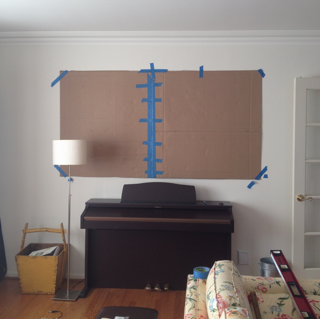
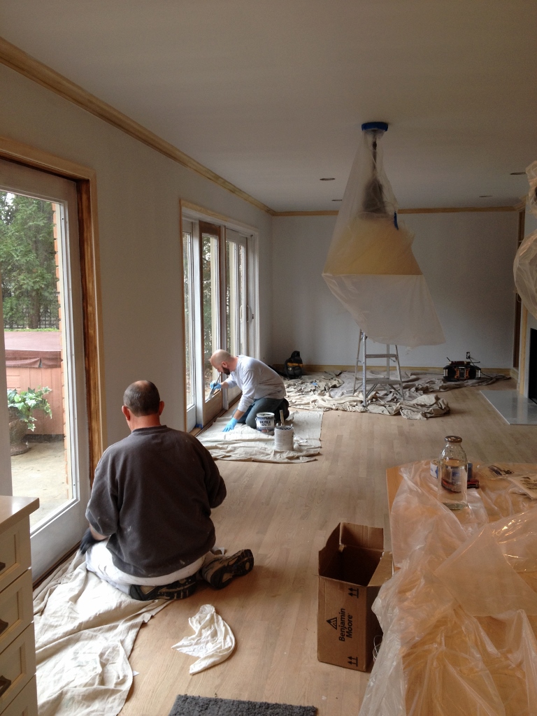
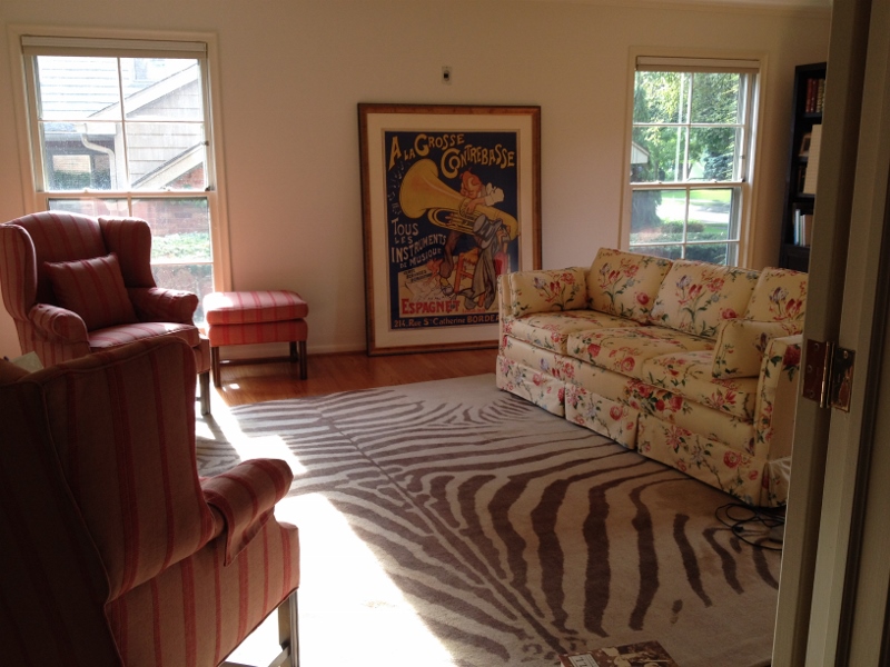
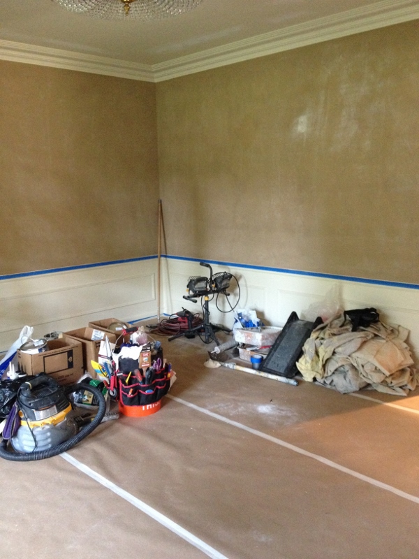
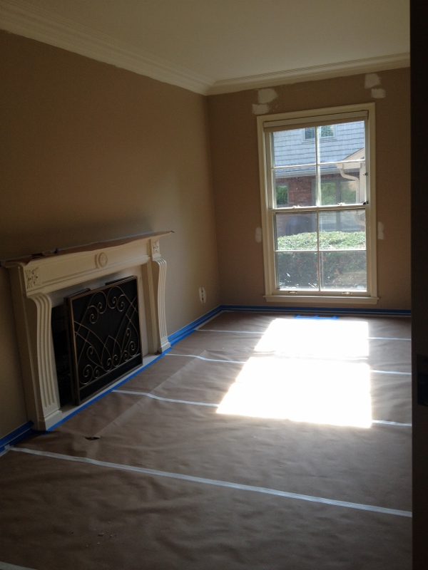
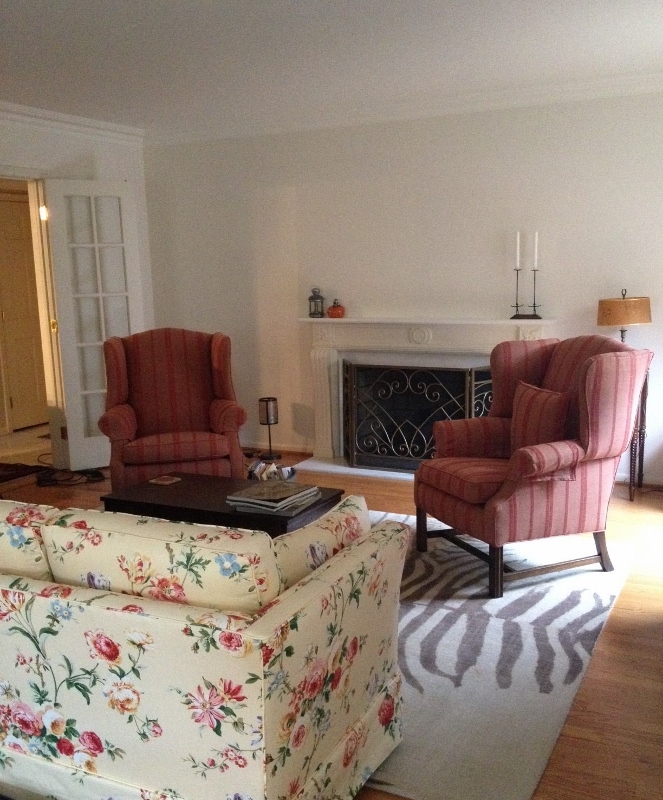
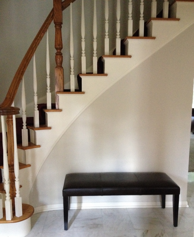
When we moved in to the house in September of 2014, the living room looked like this….house.living house.living3

I hated the beige walls (too…muddy? too blah? Plus, does anyone like beige? These people, obviously. And the lady from Calico, who recently suggested maybe we paint our living room beige. Umm). So we added the living room to our to-be-painted list.

I wanted something clean, fresh, airy. Something white. I brought home dozens of white samples (you wouldn’t believe how many whites there are) from Benjamin Moore before they started charging for the 8 x 10 sheets (which I’ve no doubt I had something to do with) and even though several design bloggers (what do they know, anyway) said to stay away from Navajo White (a “dull, boring” white), I went with it.

LRrug (1280x942)

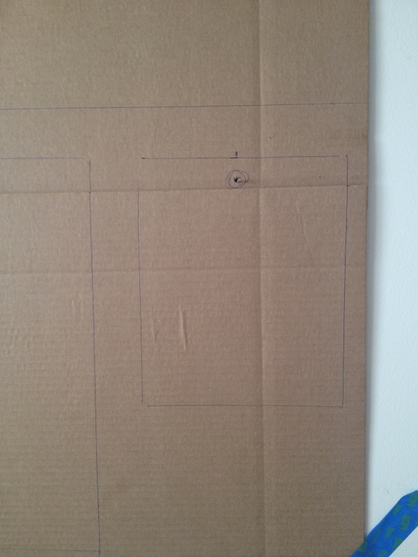
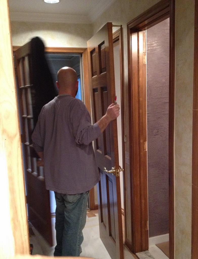
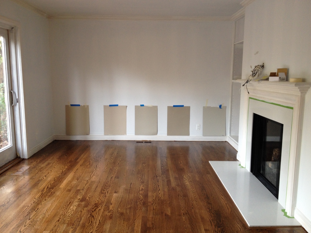
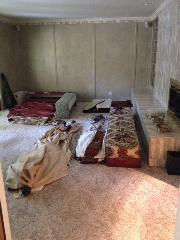
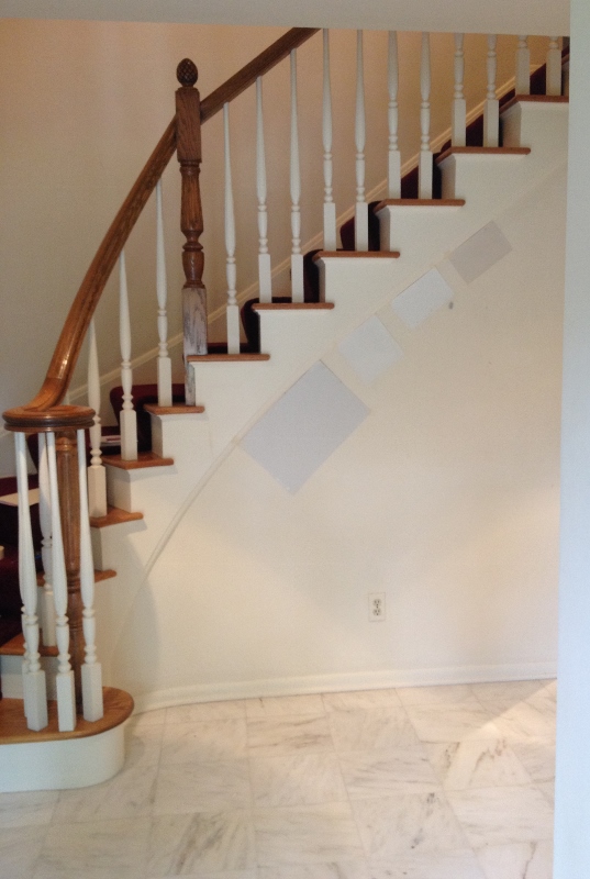
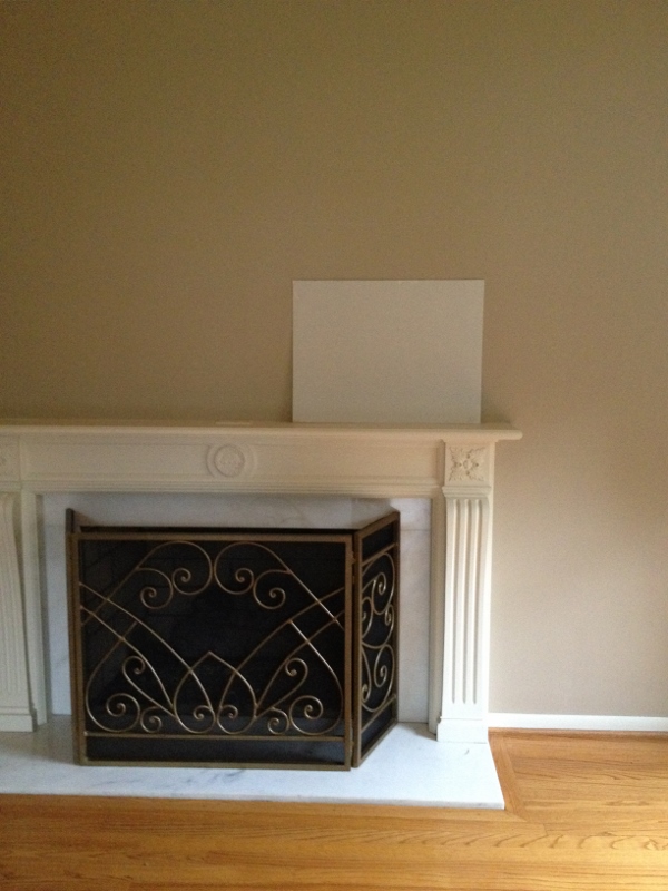
Old pic during remodel. Couldn’t find recent.

IMG_3652 (1024x768)

The color definitely helped the room. But it still didn’t feel right. Was it airy? Sure. But now it was too airy. And plain (damn those design bloggers!). I realized the problem was that I was fighting with the room. I wanted it to be a Northern California room when it so clearly wanted to be Grosse Pointe. Okay, fine.

In January (we’d painted the room in October ’14), I wanted to repaint while the guys were here doing the kitchen and family room, but my husband wasn’t on board. In November, he all of a sudden wants to get curtains and gives me the go ahead for a repaint as well. Hurray!

IMG_8953 (1024x863)

Deciding to go blue seemed the most logical choice. Our dining room was green, our kitchen, a gray-green, our hallway, a gray-tan (not beige!) and upstairs we have different variations of gray. Yellow was too….cheery and other colors like red or orange, too Victorian. I’d actually already selected a gray-blue, back when I thought we might be painting in January.

Of course me being me, I had to go through the process all over again. Back to Benjamin Moore, scouring the internet. I had visions of this….

Blue walls, pink chairs.:

to die for, right?

and this…Blue and Green: I picked up some paint samples, just to see. But painting it a deep blue, even though it would look beautiful and moody, would not really flow with the rest of the house. I tried to justify it in my head by saying that the room could be shut off with the double doors and therefore didn’t have to flow or that it was our house, we could paint it whatever we wanted, couldn’t we? But ultimately my dark blue fantasy room would have to wait.

IMG_3527 (816x1024)

But the pink chairs would have looked so great with that deep blue. Sigh.

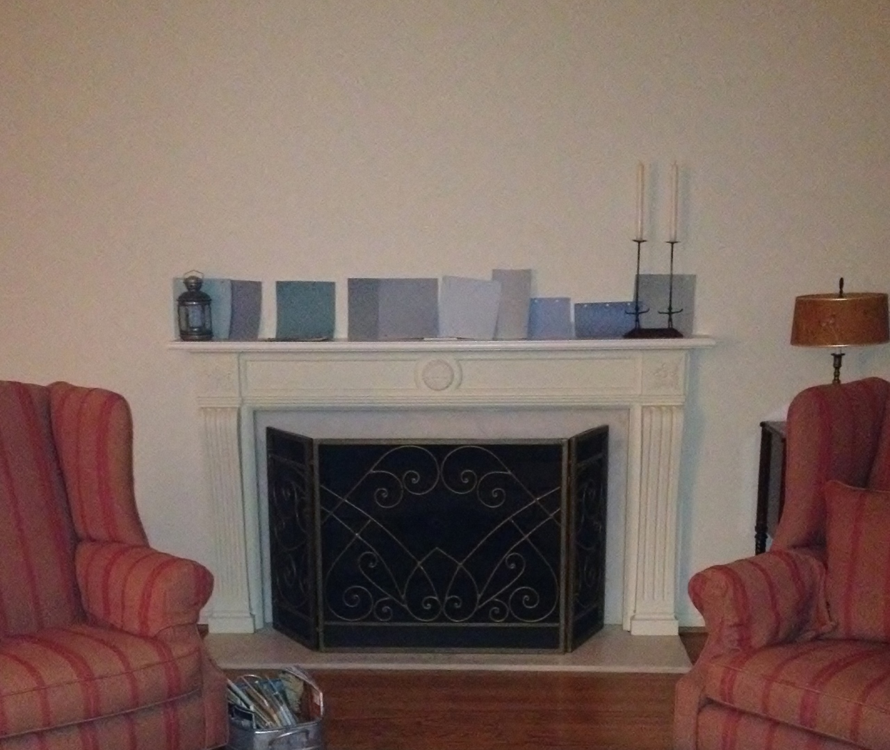
Another issue was our huge vintage poster. It has a striking blue background, so whatever blue we came up with would need to not clash with it, not match with it perfectly, not have too much green in it, etc. I was beginning  to realize that blue is a tough color to get right. As my mother-in-law stated, “it’s a commitment.”

For a day or two I toyed with the idea of a light blue (the Calico gal suggested that as well, to match the little blue flowers on the couch). And went back to the store for more samples. But a light blue living room made me think of an old lady’s house where you walk into the room and there are individually wrapped caramels sitting in a bowl. Just no.

I was going mental over it and my husband was done hearing about it. One evening, after begging him to deliberate with me once more, he rolled his eyes (okay I can’t say that with 100% certainty, but there is a high probability), threw his hands in the air (maybe) and said “well you love the dining room so much, why don’t you just paint it that color!” This ended the conversation and I was beyond annoyed. I mean beyond.

And yet.

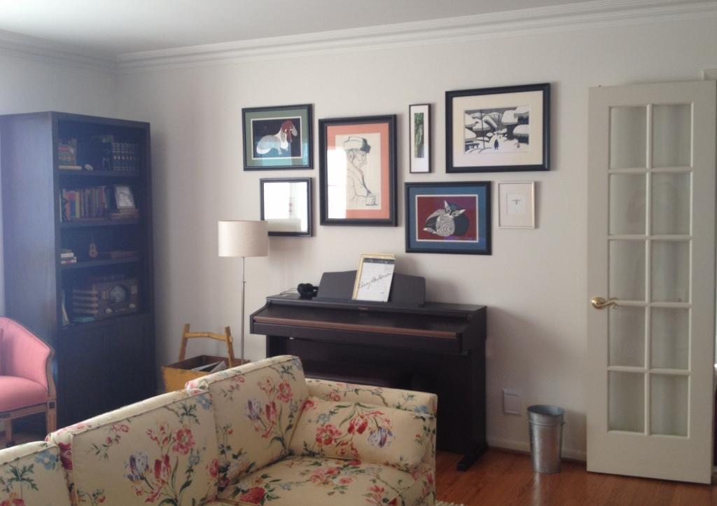
I did love the dining room color. Nantucket Gray. The perfect green. Fresh but not too bright. Welcoming, but somewhat mysterious. My favorite color in the whole house. It would solve the problem of the blue painting and would certainly flow well with the rest of the house. Genius.

livingroom (1024x768)

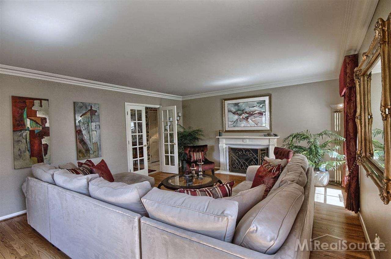
I love it. The room feels much more inviting and looks tied together. I think once we get the curtains up (another harrowing decision oh my gosh! I’m so nervous about it), it will look even better.

IMG_3677 (1024x768)

So that’s the story of how the living room got painted green.

The December List is up next. It’s snowing as I write this, but just a light dusting. We’re hoping for more this month (I mean, if it’s going to be cold, I’d rather it snow), but it’s been such a warm winter. Relatively speaking. Happy January!

The Gallery Wall

Eclectic gallery wall

Image from: myrenovatedlife.blogspot.com

I knew configuring our gallery wall in the living room wasn’t going to be easy, but I didn’t realize what an insanely huge pain it would be. My Pinterest was filled with grand, eccentric gallery walls (like the ones above and below) and I was excited to get started.

I knew ours couldn’t be as grand, given our space constraints (really the only place that worked was the small space above the piano). Nor could it be as eccentric (my husband doesn’t really do eccentric), but I was determined to make it work.

/

Image from: laurelberninteriors.com

Thankfully, designer Anna who came to the house in October (remember the zebra rug dilemma?), had already figured out and given me dimensions. I taped out the 85″ x 40″ space on our dining room floor and began unwrapping artwork (that was still packed up from our San Francisco move last Spring).

We actually have a decent amount of art (much of it was collected by our parents – pieces they picked up from their travels to Japan, China, Germany) and all of it was acquired before my husband and I started dating (hmm, I don’t like that. We’ll need to remedy that soon). It was a challenge trying to decide which pieces went well together without looking too uniform. But it was a fun challenge and I enjoyed figuring it all out.

IMG_9625 (1024x730) So now what? How were we going to transfer them to the wall? (I have to add that the art stayed on the floor like this for about a month! My husband and I both sort of ignored it, not wanting to deal with the next step.)

I’d seen articles touting the ease of cutting out pieces of paper the same dimensions of the art, taping them to the wall, driving a nail in each and voila. Simple, right?

Do this first!

Image from laurelberninteriors.com

Wrong. Cutting the paper to the exact (and we are exact around here) dimensions proved too difficult (I didn’t have thick packaging paper so I tried wrapping paper). The paper kept crinkling and it was hard to trace around the frames. And even if I did get to the point where I traced and cut them perfectly to size, I’d have to arrange them all over again on the wall, which was going to be a headache.

My husband suggested cutting a piece of cardboard (to the display dimensions), arranging the pieces again and tracing around them. This was the hardest part for me. I took pictures of the layout so I could recreate the display, but when I tried to arrange the art on the cardboard, it just wasn’t right. It took SO much tweaking before I was satisfied (I’m talking eighths of inches, but when you’re dealing with something you’re going to see every day, it has to be perfect).

IMG_9939 (600x800)He ended up tracing the art (using a level, to make sure everything was straight) and figuring out where the nail holes should be. Thank goodness he took over at this point, because for sure I would have screwed something up.

IMG_9938 (1024x1022)Then he centered the cardboard over the piano, taped it up and re-marked the nail holes on the wall (through the cardboard). He also put all the artwork up on the wall and leveled each piece.

IMG_9941 (1024x722) Hurray! I really happy with how it turned out. I regret not having the painters re-paint the walls a deep gray-blue (Brewster Gray, I love you!) while they were here doing the kitchen/family room. It would have added a dimension and feel to the room, adding mystery, while also making it more inviting. But it’s still a possibility down the line and the gallery wall definitely helps pull the room together and makes it feel more lived-in.

Kitchen Remodel – Weeks Seven and Eight: Painting, Fireplace and Floors

You guys. I don’t even know what week we’re in on the remodel (okay now I do, I just looked. Week nine!). I’ve been going nuts with Christmas approaching (family arrives in three days!) and have been behind on the blog. I spaced taking photos of some things (like the three different stains we chose from for the floors), but at least I have some documentation of weeks seven and eight.

IMG_9160 (768x1024)The painters started doing their thing at the beginning of week seven, so our access to our new kitchen was short-lived. More sanding (aka more dust) and priming.

IMG_9161 (768x1024)And doors were taken off to be sprayed at the warehouse.

IMG_9065 (784x1024)The fireplace was set up.

IMG_9168 (768x1024)And the floors were sanded…

IMG_9169 (768x1024)

Heavy-duty vac.

Heavy-duty vac.

And stained.

IMG_9170 (768x1024)I prefer light wood floors and my husband prefers dark. For some reason, though, I didn’t put my foot down on the floor color. We had dark floors at our flat in San Francisco and they were quite nice. Plus, since the floor had to run through both rooms, I felt a darker stain would warm up the family room section and would be a nice contrast to the white cabinets and backsplash.

We had to move out for a couple days while the floors were being finished, as the fumes from the process are extremely potent. Luckily we have a huge attic fan, which really helped air out the house when we got back.

With the floors complete, all that was left was our final decision on the paint color.

IMG_9190 (1024x768)I won’t even tell you how long I spent just narrowing it down to these five. Most people whose opinion I asked chose Revere Pewter, a neutral gray color (far right). It IS a lovely soft color (duh. I chose it out of thousands). But in the end, I went with my gut, which was Pashmina, a light grey-brown neutral with a hint of green (middle). I felt Revere Pewter was too close to our hallway color, and I wanted this room to feel separate.

Since we’re already in week nine, I can tell you that I’m very happy with my choice (whew!). Pictures soon.

Our Living Room Rug: The Final Chapter

IMG_8214 (800x600)For those of you following the blog, you know all about the living room rug dilemma.

In a nutshell: bought living room seating at estate sales. Bought zebra rug (new) intending to recover the sofa, but after learning that a reupholster job would cost big bucks (and after seeing that the sofa actually went well with the chairs and painting), we (I mean me. My husband was hands in the air on this one) decided to get a new rug.

LRrug2 (551x735)Ta-da! Alright, I’m sorry for the crappy photo. Perhaps a less lazy blogger would have taken the two blankets off the sofa (that she JUST got through tucking in perfectly so the dog wouldn’t completely junk it up during the remodel), but I didn’t have it in me. You’ll just have to imagine the sofa in full floral glory.

After spending hours and hours (I’m so not kidding. HOURS) on design websites and shops, and after consulting with a million people (okay, this time I’m exaggerating), decided on a 10 x 14 neutral hemp-wool blend rug by Safavieh that I found on Overstock. It’s funny, many sites listed it as a jute-wool blend, but it is actually a hemp blend (is the hemp thing still that off-putting to some?).

LRrugClose (552x735)

Part of me wanted to go really eclectic and I came up with some options like this one from Serena and Lily….

Feather Rug – Bark/Smoke | Serena & Lily 10 x 14. Too much? / Also in Army/Turquoise / $1800

and this one from Anthropologie (although I later saw it was a viscose blend, which I’d read negative things about) …

and a Persian-style one from One Kings Lane…

Medlin Rug, Taupe | Cool & Current | One Kings Lane - Good Browns, but purples might clash?

All of which may have worked fine (or possibly not), but I just wasn’t willing to make such a bold leap, only to find out I was wrong. The thin stripes on the new rug add a bit of excitement and the bumpy texture adds depth, which the room really needed.

And where is the fantastic zebra rug? In the little one’s room. It looks perfect.

ZebraRug (551x735)

ZebraRug2 (551x735)And so, the living room is finally done!……

Or is it!?!?!……

IMG_8953 (1280x1079)Stay tuned.


Meet John, the Painter

IMG_8134 (600x800) I’ve been delaying this post, because I’d hoped to show you some of the rooms. Before and after photos and all that. But all the rooms are still works in progress, and now I’m sitting in the dining room (my temporary office and kitchen), listening to ridiculously loud noises coming from what used to be our kitchen and family room. The demolition has started. But it is nevertheless time to introduce you to John, the painter.

John’s father Nick immigrated to Detroit from Greece in the late 1950s. Nick started the company in 1965 and fifteen years later, John and his brother took over the business. He says it’s the only job he’s ever had (working for the company in various capacities). And what do you like most about it?, I asked. He loves everything about it; he doesn’t feel the need or the want to do anything else. And he’s gotten to work for a lot of influential people.

IMG_8135 (600x800)You can tell John feels a lot of pride for his company. I asked what sets Nick Karoustos apart from other paining companies and John emphasized that it’s a family-owned and operated business, and that they do not sub-contract their workers (which is one of the reasons we hired). They provide healthcare and benefits to their employees, “which provides longevity and stability,” he added.

IMG_8136 (600x800)

The window coverings came down and stayed down (though we did keep one set for the guestroom).

And trends? People are going more neutral (see, we’re on trend. I knew it). He doesn’t see too many faux finishes anymore. And wallpaper is coming back (HA. You knew that one was coming, right?).

John declined a photo. (But if he comes back to paint the new kitchen, I’ll try again!).

The house looks great with the new paint. The color in the dining room is the perfect shade of green. And you’ve already seen the white living room (which again, is by no means finished. We need to decide which painting to put above the fireplace, for example. And you know all about that rug.)

house.living

I do like that they have plants. We need indoor plants.

living

From the photos, it doesn’t look like a huge color difference, but the lighter walls really brighten up the room (literally and figuratively).

The girls’ light grey rooms are great. Here’s one of the bedrooms.

house.3rdbedroom (800x533)

Before.

lucy

After. (And see, wouldn’t the zebra rug look great in here?)

But the entryway is very……blah. It’s my one paint regret. With some new decor (eventually a console table and a lamp instead of a bench), I think it will be a lot more exciting. Win some, lose some.

homes.wallpaper

IMG_8463 (653x800)

BO-ring. Until we spruce it up.

The designer friend I hired did ask if I like wallpaper (DO I!) and suggested putting wallpaper in the entryway only (near the front door, where I’m standing to take the photo), which would make a statement and add some interest. I thought it was a great idea and as soon as we can make it happen (after Christmas?), you’ll be hearing about it.


In Pursuit of Paint

IMG_7871 (600x800)If you’ve been following the blog, you know that I’ve been obsessed with finding the perfect paint colors for the house. Now that the wallpaper was off and the hardwood floors uncovered and cleaned, it was time to paint. I’d already met with Tim over at Shelby Paint, but now I had to put our selections to the test.

I bought a bunch of samples and let the girls help me paint poster boards (as you can see, the above pic was taken a while ago – Lucy is still in diapers and we’re still at the Apartment), which they were thrilled about. Then I took the boards to the new house to check them out.

IMG_7882 (537x800)Color is a very tricky thing, as I have learned over the last couple months. I knew it already, but wow. Colors change from one room to the next, from one foot to the next even, sometimes. And of course they change drastically depending on how light or dark the room is.

Initially I’d picked Athena for the entryway (the largest of the samples above), but now it appeared too blue. We (meaning me, as my husband was rolling his eyes at this point) decided to go with Manchester Tan instead, the darkest color shown above.

IMG_7873 (601x800)Our dining room pick, Nantucket Grey, was perfect.

IMG_7875 (600x800)And for the living room, we were originally going to go with Athena as well, but again, it looked too bluish. I really wanted a light, airy feel to the living room, so I went with the controversial Navajo White (poster board is Athena). Before selecting a white, I went online and read various reviews from both experts and DIY folks. Many experts poo-pooed Navajo White, saying that it felt too “rental apartment” or boring. But that Linen White was a beautiful white.

Anyway, I looked up Linen White, and it is seriously almost exactly the same formula as Navajo White. So there. And I went with the old design rule (whose rule? I don’t know, but I’m sure it’s a rule), if you like it, then who cares what anyone else thinks?

COMING UP: In my next post, I’ll introduce you to John, our painter, and reveal my one color regret. Can you guess?